LET’S GO DUTCH: HIGHLIGHTS FROM THE DE VEEZE COLLECTION AT THE WOLFSONIAN-FIU LIBRARY
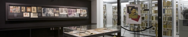
Not long ago, I had the pleasure of being asked to provide some guests from the Netherlands with a private tour, highlighting, of course, the incredible range of Dutch language materials in our rare book and special collections library. I always find it more than a little intimidating to be talking to guests about materials published in a language in which I am not conversant. The up side, however, is that I get the chance to rummage through a treasure-trove of unfamiliar materials and invariably to learn more about our collection from the visitors taking these tours. This was certainly the case when I was introduced to Max van Alphen and his daughter, Felicitas, and had the opportunity to talk with them about the De Veeze Collection and other Dutch materials in the back stacks.
The Wolfsonian library actually holds perhaps the greatest concentration of Dutch Nieuwe Kunst (or, Art Nouveau) book bindings and ephemera (calendars, advertisements, proofs) outside of the Netherlands. Many of the most renowned artists working in the Netherlands between the 1890s and 1920s are represented in our collection. The leaves for a 1896 calendar, for example, were designed by Theodoor Willem Nieuwenhuis (1866-1951).


Also on display in our fifth floor museum galleries is a door from a study in the residence of Ferdinand Kranenburg designed by this same artist, and manufactured in the workshop of E. J. van Wisselingh & Co.

This is the kind of object that can inspire hinge and hardware envy!
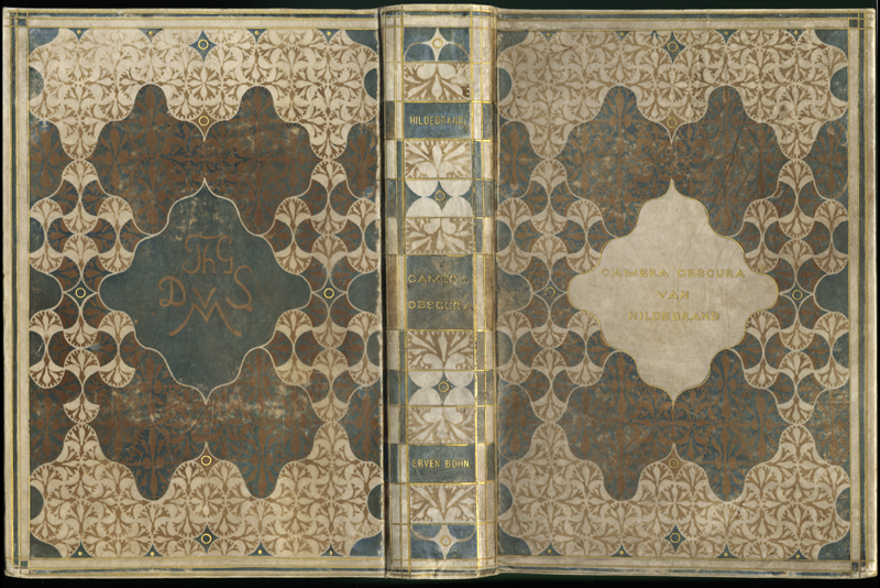
As is obvious from the plates and door above, the Art Nouveau aesthetic drew inspiration from the natural world (plant forms, flowers, insects, and the curvilinear shapes). Thanks to the help of several visiting Dutch scholars and fellows, such as Dr. Marjan Groot, we have been able to identify a surprisingly large number of Nieuwe Kunst book bindings in our collection as having been designed by women artists. Below are examples of a few such book covers designed by Anna Sipkema (1877-1933) and Cornelia van der Hart (1851-1940).


Typically, the Art Nouveau designs on the bindings had nothing to do with the content of the books, but were intended merely to create a front cover and spine enticing enough to win over a prospective buyer; more often than not, the designers did not bother to decorate the back covers.


Where the Nieuwe Kunst differed from other European expressions of the “New Art” is the use of a distinctive color palette (reflecting a penchant for black and gold); interest in Socialism and social welfare issues; and the inclusion of “exotic” motifs and techniques introduced to the motherland from her colonies in the Far East.


One irony that comes out of the art nouveau aesthetics is that books with radically different topics (one celebrating the Dutch monarchy, while another describing the theory and practice of British Socialism) have remarkably similar covers, neither of which very well reflect the intellectual content of the work.


Many of the bindings in the de Veeze Collection, were designed by artists who had either lived in or otherwise been influenced by the Dutch East Indies. Many of these artists introduced an Orientalist approach to art, adopting a holistic vision, often with an insistence upon symmetry.


One particularly important “Oriental” technique brought back from the colonies in Indonesia was that of the batik (a hot wax approach to textile design producing patterns reminiscent of those tie-dye techniques popular in the 1960s).

Artist Chris Lebeau (1878-1945) used the batik technique to create many color variants for his cover design for novelist Louis Couperus’ De Stille Kracht, set in the Dutch island colony of Java.


The Orientalist cover is a perfect complement to the story which dwells upon the “hidden force” or “silent power” of the East. While Otto van Oudijck, the Dutch colonial administrator at the center of the novel’s plot, originally disregards Eastern mysticism as superstition. By the novel’s end, however, he has come to appreciate and learned to respect the mysterious forces of the East, going so far as to “go native”—living with an indigenous woman and adopting her family as his own. I never would have come to appreciate the subtleties of the novel had not our visitor, on his return to the Netherlands, so generously mailed me a dvd of the television mini-series directed by Walter van der Kamp in 1974. I found the series so compelling that I found an English language version of the book on-line courtesy of the Gutenberg Project and read it in a single sitting.
Other Dutch artists such as Gustaaf Frederik van de Wall Perné (1877-1911) also helped popularized the batik technique.


Others, including C. A. Lion-Cachet (1864-1945), adopted a more radical approach, adapting and refining the technique to create entirely new and striking patterns on entirely new forms and surfaces.

As becomes obvious from perusing the designs of these artists, this was not a simple case of Europeans imposing their cultural hegemony abroad, but rather an exchange of ideas about art between the mother-country and her colonies.

At least a few periodical covers and book bindings designed by Jan Theodoor Toorop (1858-1928) hint at another influence coming out of the colonies: the recreational use of opium.


One of the delightful elements of the de Veeze collection is that it includes not only thousands of Nieuwe Kunst book-bindings in pristine condition, but also some of the original sketches and drawings by the artists designing the front and back covers and spines. Happily, we can pair and compare the original artwork (often with editorial notes from the publishing house) to the finished products.


DESIGNED BY HERMAN TEIRLINCK (1879-1967)


DESIGNED BY C. A. (CAREL ADOLPH) LION CACHET (1864-1945)

Thanks to a grant from the National Endowment for the Arts, much of this collection can be seen in high-resolution on the State of Florida’s PALMM website.
One other happy circumstance arising from these VIP tours is that in rummaging through the collections, one occasionally comes across an item that you have not seen before that fits into other themes. The Wolfsonian will be preparing an exhibition to commemorate the hundred year anniversary of the outbreak of the First World War next year, and so I was delighted to come across the following Dutch calendar relevant to that show.

Surpirses: WWI calendar weeping widow

Que bonito arte y muy expresivo.
Interesante y agradable Blog. Felicitaciones!
This is a wonderful post! Gorgeous images — I love the Wolfsonian. I’m curious why I never saw it (or any of the posts in this blog) as I was under the impression that I subscribed to your blog in a reader. Well, I’ve found you now — Yay! Thanks.
[…] Theodoor Willem Nieuwenhuis, calendar leaf, 1896. Source […]
My Blog said this on April 4, 2015 at 10:39 AM |
[…] The books in the header photo above are some of my favorite Art Nouveau book covers from our Dutch collection. I love how books can be both works of art and historic objects in addition to serving as carriers of information. You can see the full book covers and other interesting highlights from the Dutch collection on our library blog. […]
Hello world! – A New Chapter said this on August 18, 2019 at 2:58 PM |
[…] Found on The Wolfsonian library. […]
13 Things I Found on the Internet Today (Vol. CDXCXII) said this on May 11, 2020 at 8:32 AM |
[…] Nuestro agradecimiento a las colecciones digitales de la Wolfsonian-Florida International University. […]
Un calendario Art Nouveau — Patrimonio Digital de la Humanidad said this on May 25, 2020 at 1:57 PM |